About
This case study is the result of my work on a briefing from Aela's UX Bootcamp. The goal was to improve the user experience on a landing page of a digital bank. My choice was to work with Maré Bank.
This case study is the result of my work on a briefing from Aela's UX Bootcamp. The goal was to improve the user experience on a landing page of a digital bank. My choice was to work with Maré Bank.
Deliverables
• Wireframe
• Final UI
• Wireframe
• Final UI
My role
I lead the UX process working independently.
I lead the UX process working independently.
Date
June 2020
June 2020
Background
A landing page acts for a specific business purpose, which can be bringing more user registration, increasing the number of downloads of an app or selling a certain service, for example. It's all about an experience for conversion: creating a structured flow so the user know everything they need in order to want to push the call-to-action button.
During this project, I will work on a new landing page for Maré Bank, a blockchain powered digital bank focused on financial inclusion. The aim of the page is to show the services offered by the bank in order to bring more clients.
Project Summary
About Maré Bank
With the motto, “A Simple Bank for a Simple Life”, Banco Maré offers an accessible and free platform of financial services, based on a mobile app and supported with local presence - Kioscos are local shops that offer Banco Mare’s services and provide customer support.
With the motto, “A Simple Bank for a Simple Life”, Banco Maré offers an accessible and free platform of financial services, based on a mobile app and supported with local presence - Kioscos are local shops that offer Banco Mare’s services and provide customer support.
"Our customers are part of the 1.7 billion people unbanked worldwide and 55 million unbanked people in Brazil." (https://bancomare.com.br/indexEnUS.html)
Business goal
Attract new customers to Maré Bank.
Attract new customers to Maré Bank.
Conversion goal
Users to click the “Criar conta” button, which leads to Google Play page for download the app.
Users to click the “Criar conta” button, which leads to Google Play page for download the app.

The user: for whom Maré Bank is for
In order to craft a page with information that makes sense and works for the purpose of bringing more clients, I needed to understand who are the potential customers of Maré' services. With the data obtained through a secondary research I was able to define the following main characteristics of this group:
Unbanked residents from areas where there are no local bank agencies: with Maré they could pay their bills and do purchase digitally, with a prepaid card or an app on selected places. (https://revistapegn.globo.com/Startups/noticia/2019/02/empresario-cria-banco-para-populacao-de-baixa-renda-do-rio-de-janeiro.html)
Small business that can use the PO machines to receive payments for their services (https://www.mobiletime.com.br/noticias/29/11/2019/banco-mare-vai-oferecer-maquinas-pos-a-pjs-de-comunidades/)
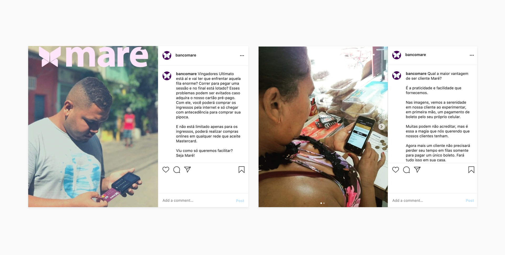
On their social media, Maré shows some examples of daily life where the bank can bring more facilities to people who didn't have access to traditional financial services before:
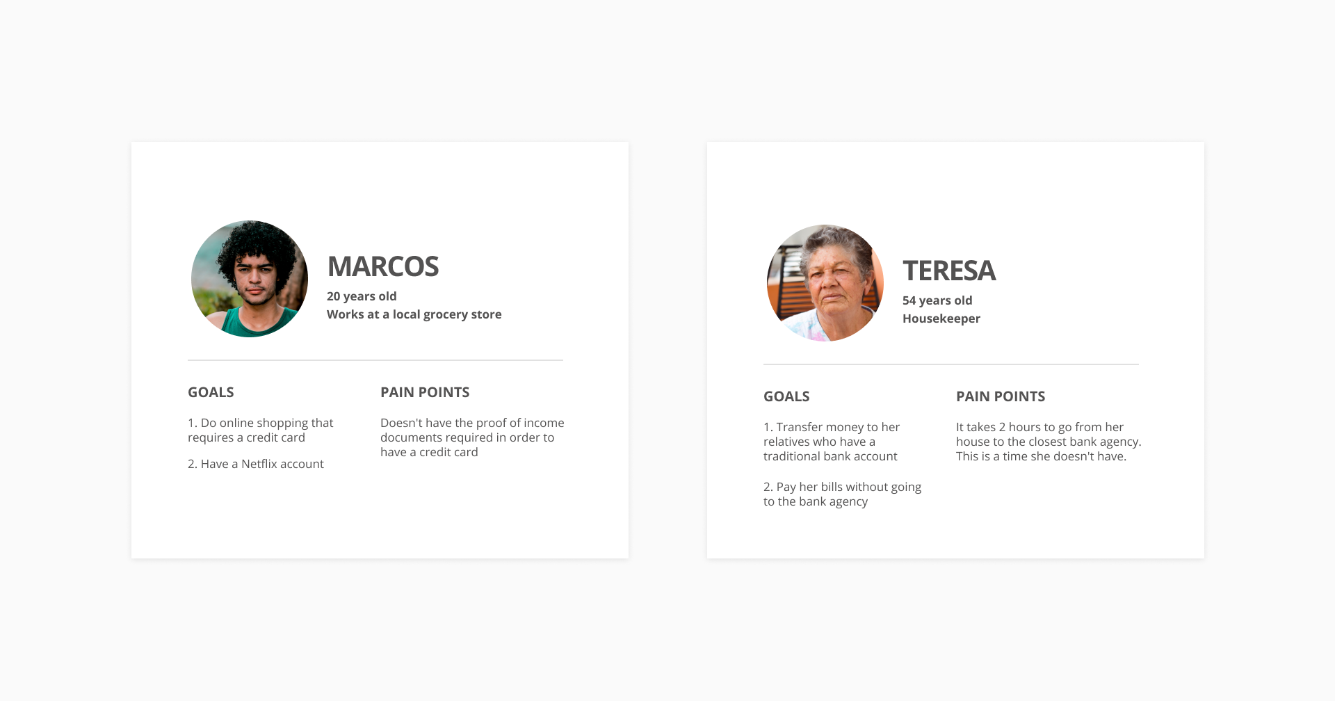
To make it more personal, let's give them a name: Marcos and Teresa
I used the info collect to create 2 proto personas in order to keep the process human-centered, considering the pain points and goals that people may have using the services from Maré.

What are the services Maré Bank offer to them?
• Prepaid credit card
• Digital Currency - the Palafita
• POS machines for small business
• Digital Currency - the Palafita
• POS machines for small business
All the services aim to make the life of unbanked residents from distant communities easier: give them digital financial options so they don't need to go to other neighborhoods to pay bills and use a regular bank, since there are no agencies in their nearby.
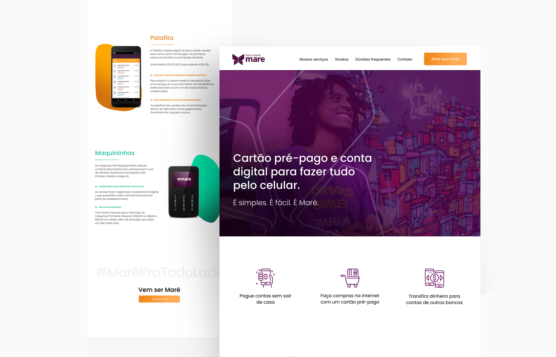
Screenshot from current “our services” site section

What do Maré's clients talk about them?
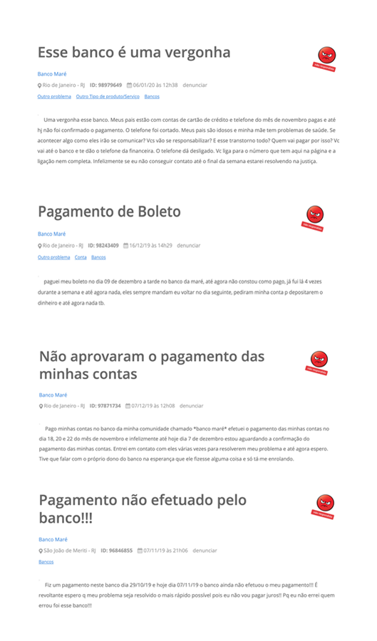
Maré doesn't have a strong online presence regarding customer service. I could find only a few reviews from clients on Reclame Aqui, all of them talking about system delays in recognizing the payment of bills.

Competitors analysis: which companies offer something similar to Maré
The closest market offer to Maré's service in Brazil are the regular digital banks.
Not all of them offer a digital currency, but can related to Maré due their offerings on financial options in the digital world.
Not all of them offer a digital currency, but can related to Maré due their offerings on financial options in the digital world.
To understand what kind of products these banks have and how they show them on their sites or landing pages, I did some desk research comparing the following aspects:
• What is the main CTA on the page and to where it leads the user
• What is the main message/key differentiator
• List other differentiators
• Does it have an humanizing image?
• How can the user contact the bank?
The research documentation can be accessed here
• What is the main message/key differentiator
• List other differentiators
• Does it have an humanizing image?
• How can the user contact the bank?
The research documentation can be accessed here
The researched showed some points that were common for the majority of the banks and I considered as something to care about during the project for Maré:
• 75% of analyzed banks brings at least one human photo
• All the CTA buttons had a clear message about the service, as “open an account” or “become a member”
• All the banks showed their key differential on the first block on the page
• All the CTA buttons had a clear message about the service, as “open an account” or “become a member”
• All the banks showed their key differential on the first block on the page
I also checked the social media and consumer complaints websites to see what clients were talking about the brands in order to get some insights about what could be brought to the landing page and improve the communication of services from Maré.
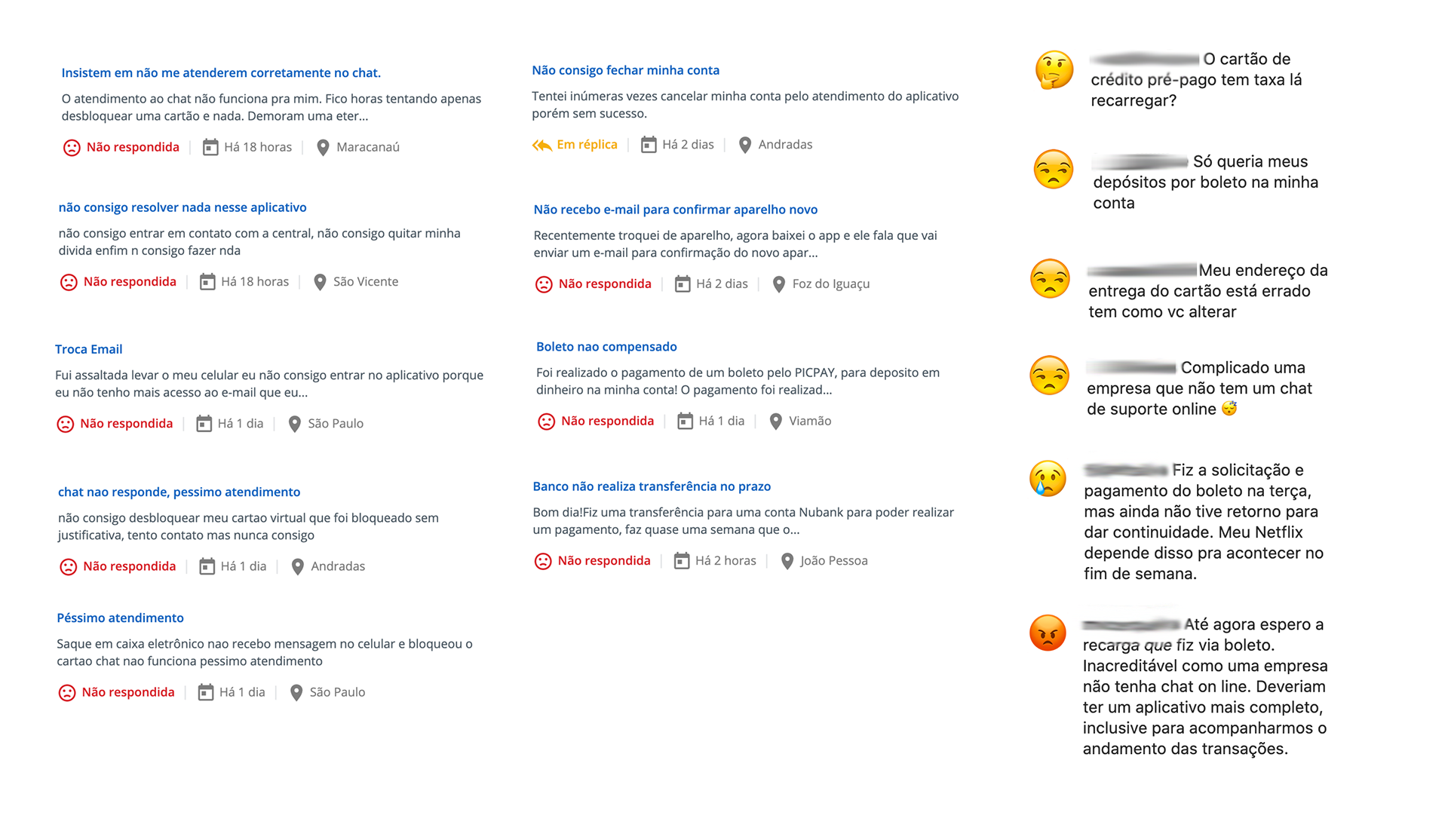
It was possible to noticed that people who usually post something into these sites are really frustrated, especially because the problem they have is about something so sensible as their money. So almost no positive comment was found, except for Nubank, that has a huge strategy of costumer experience, known for their excellence work, so they have more positive reviews on social media and complaints websites (source: https://www.linkedin.com/pulse/o-customer-experience-do-nubank-yuri-dantas/).
Around the negative reviews from all the competitors, the patterns that emerged were:
• Many complaints about the delay in getting the credits on the account for deposits
• Many complaints about payments that took too many days to be recognized
• The phone chat doesn't work all the time and is slow
• Problems with registration to create an account
• Doubts around fees to have a prepaid card
• Doubts around transfer and how to use the app
• Doubts around how to use the prepaid card for online purchases
Some of these answers could be found in the FAQ section from the banks pages, but not all of them. And even that the first contact with the bank may not be through the site when the client is in trouble, seems reasonable to have as many answers as possible on the FAQ section. What leads me to answer the question for Maré Bank:
What goes on the landing page?
Getting back to the start and considering the goal of Maré's landing page and the needs around information that a prospect client as Marcos or Teresa could have, it should contain:
What is Maré
The company needs to be trusted for the new clients, so it's important to show information that brings credibility to the business.
The company needs to be trusted for the new clients, so it's important to show information that brings credibility to the business.
Detail the service Maré offers
Since Maré offers something that is so different from other banks to an unbanked person, it needs to be detailed so they can really understand.
Since Maré offers something that is so different from other banks to an unbanked person, it needs to be detailed so they can really understand.
In order to achieve this, I tried to use words that are more commonly used for the services. The term POS machine, for example, could be something hard to understand to the big public, so I made extra secondary research and could notice that the term “Maquininha” was something more understandable for everybody, that most brands of POS machines use in Brazil.
Where I can find Kioskos
Kioskos are the local agencies where clients can exchange Reais (R$) for Palafitas (PLF) and also get a prepaid card. A link that leads to a map pointing where these agencies are could be really valuable, so clients could note that they are close to their homes.
Kioskos are the local agencies where clients can exchange Reais (R$) for Palafitas (PLF) and also get a prepaid card. A link that leads to a map pointing where these agencies are could be really valuable, so clients could note that they are close to their homes.
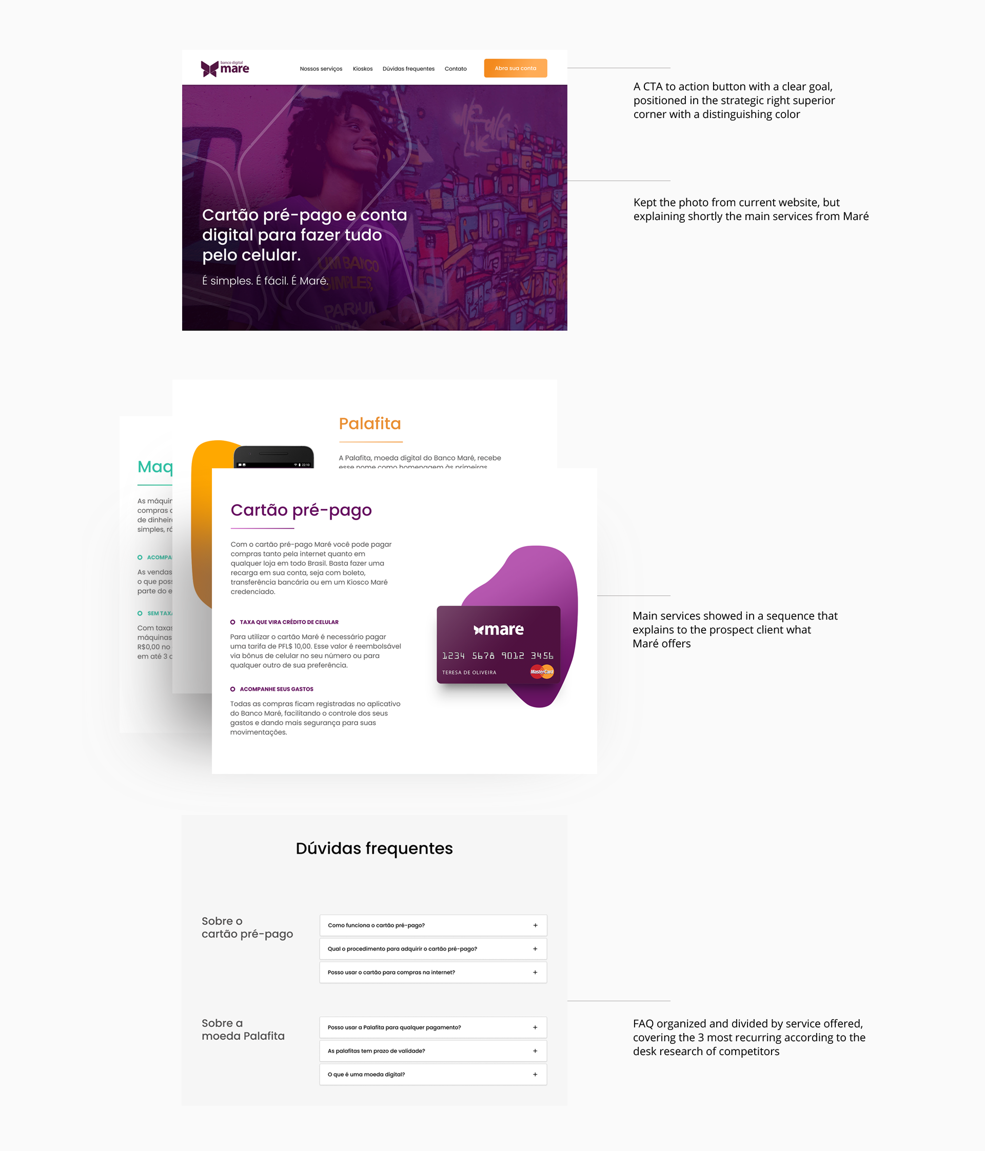
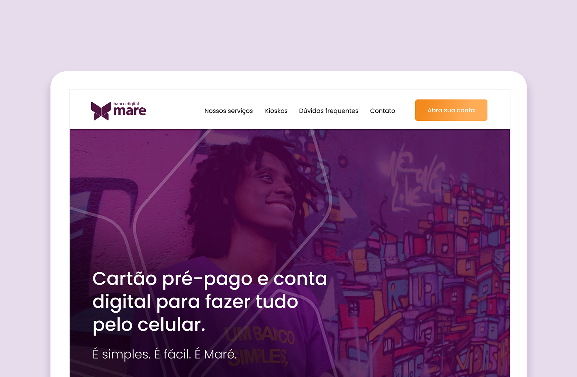
A CTA to download the app
All the registration is made through the app, so the landing page is more informative. A clear CTA to download the app must be visible so new clients can join the service. The current landing page shows a CTA with the message “Download app” but the competitor research showed that all the other digital banks brings a message more focused on create an account or become a member, which made me think that download the app doesn't say much about the service Maré offers. For this, my suggestion is to use a CTA with the text “Create an account”.
All the registration is made through the app, so the landing page is more informative. A clear CTA to download the app must be visible so new clients can join the service. The current landing page shows a CTA with the message “Download app” but the competitor research showed that all the other digital banks brings a message more focused on create an account or become a member, which made me think that download the app doesn't say much about the service Maré offers. For this, my suggestion is to use a CTA with the text “Create an account”.
Contact options
FAQ
The current page has a FAQ section, but considering the comments from clients found during the desk research, it could be improved within the UX writing. Some doubts that I found in comments from clients from other banks but could easily be doubts from Maré's clients were:
• Is this a traditional bank account?
• Do I need to have a CPF to have an account
• How do I pay bills on the app?
• How do I do transfer to other bank account?
• How many days does it take to get a payment in the system?
• Do I need to have a CPF to have an account
• How do I pay bills on the app?
• How do I do transfer to other bank account?
• How many days does it take to get a payment in the system?

To care about: the constraints for the landing page
Maré bank aims to offer service to unbaked people, mainly in low income areas, where internet access can be really limited, both in speed and hardware options. This was something to consider while thinking about components for the page: everything should be really accessible for any kind of computer or smartphone.
Design Principles
Considering the needs for both Maré and its clients and also the constraints for the page, I came with the following Design principles to look for:
• Easy to understand what Maré is
• A crafted storytelling to support the CTA buttons
• A look and feel that is not intimidating, what could make the new clients think Maré is like a regular bureaucratic bank or something too fancy
• A crafted storytelling to support the CTA buttons
• A look and feel that is not intimidating, what could make the new clients think Maré is like a regular bureaucratic bank or something too fancy

Sketching ideas + wireframes
To experiment the ideas with something visual before working with pixels, I sketched the landing page in paper.
This could help me understand a better way to work in the page in order to tell a story, in a logic sequence of information that could inform the prospect client with all the info they might need to open an account. After some iterations, I came up with a digital wireframe before going to the final UI.
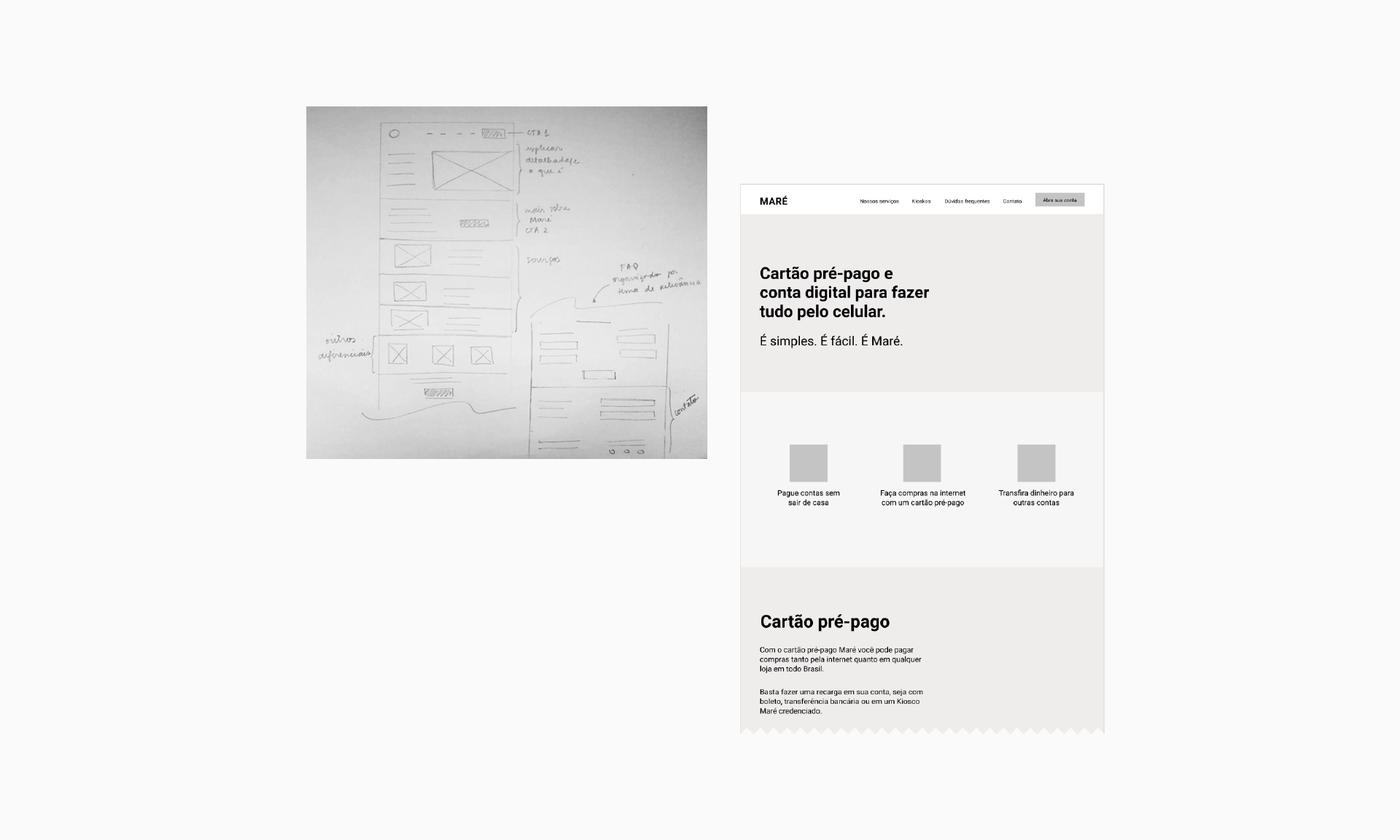

Look and feel
The UI should reflect the brand message: offer financial services for the unbaked population. I gather some visual material that Maré already uses in their communication to have a point where to start.
I also considered what kind of visual elements could work for both Marcos and Teresa, the personas that represent some users and show different ages and technology knowledge. The elements could not be something too young but at the same time needed to be fresh.
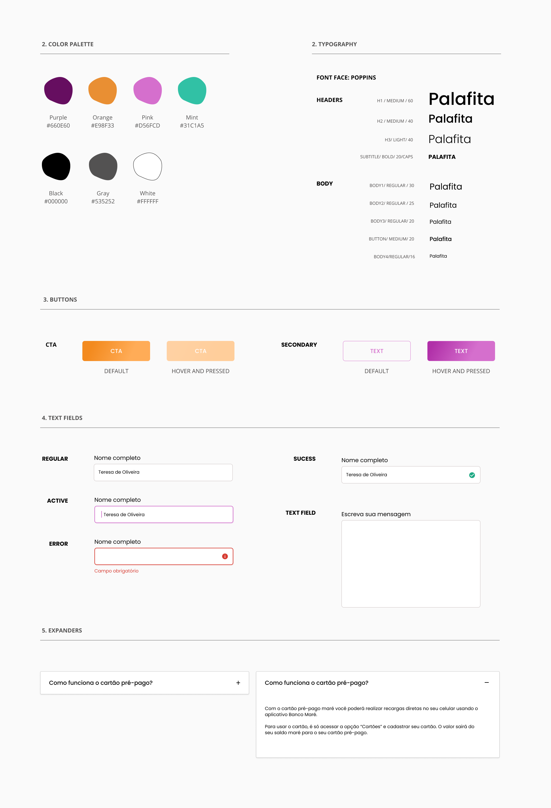

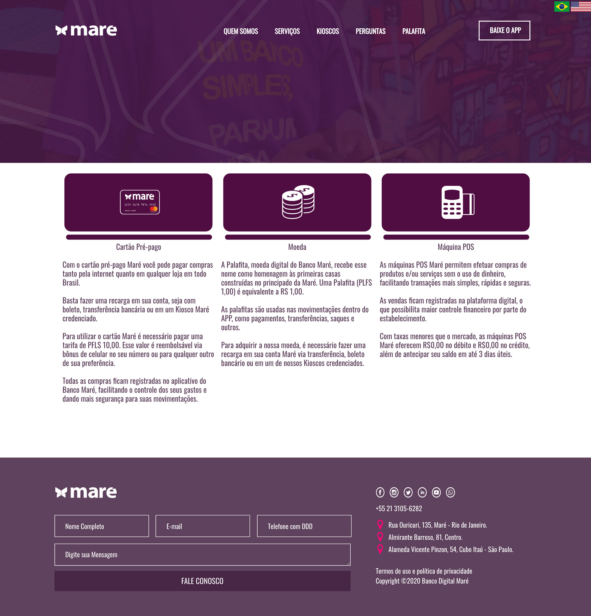
Final UI